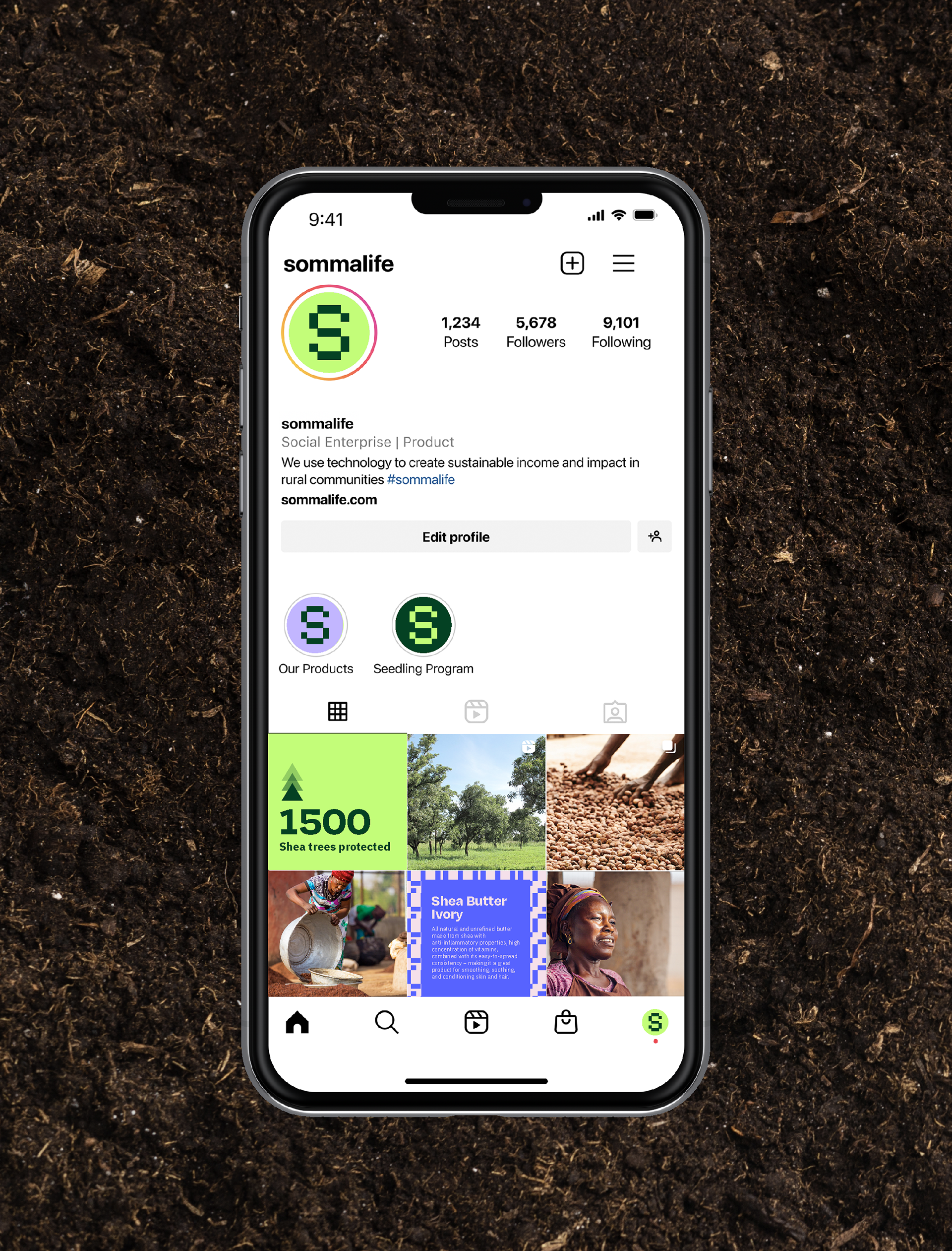
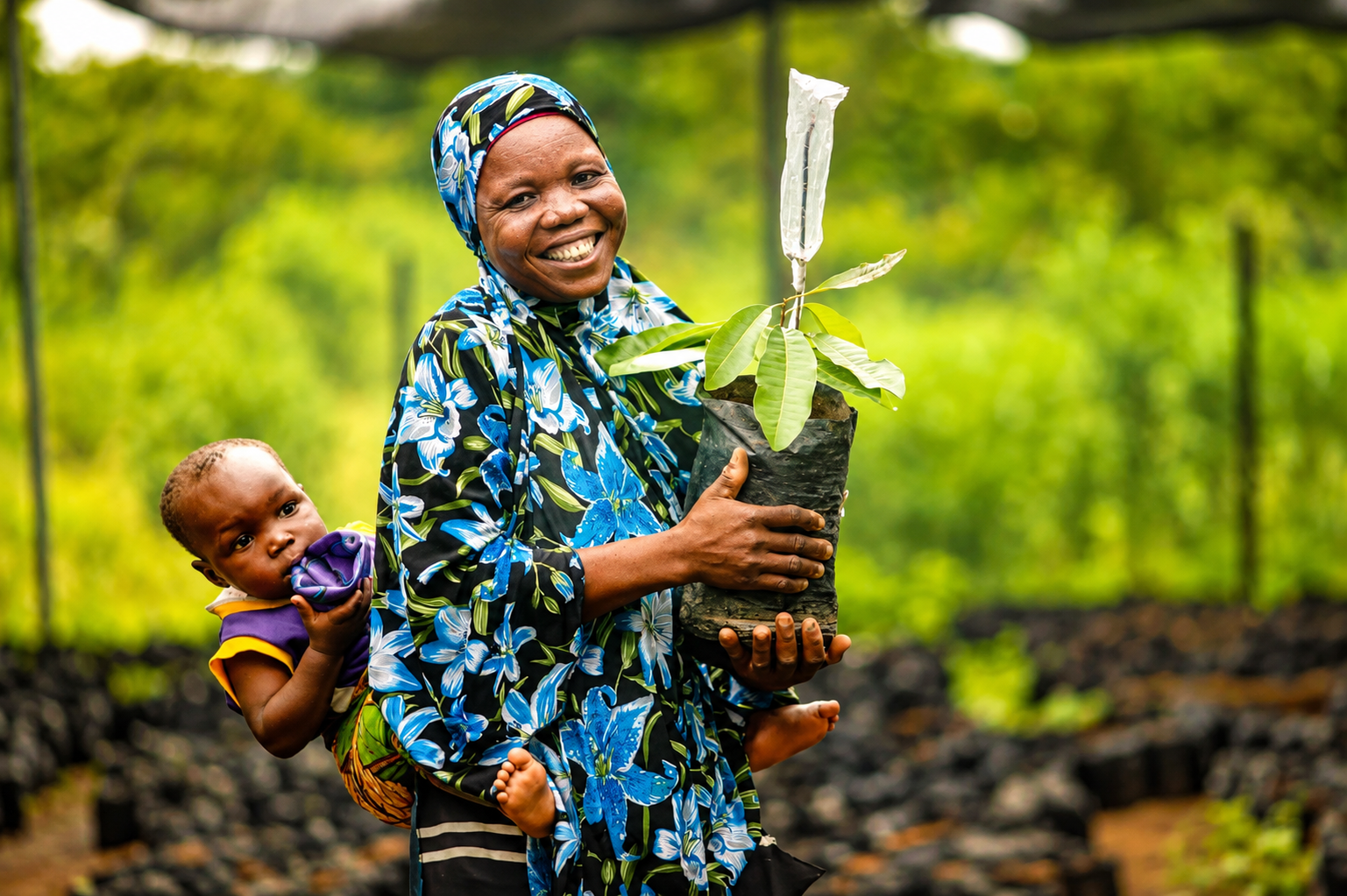
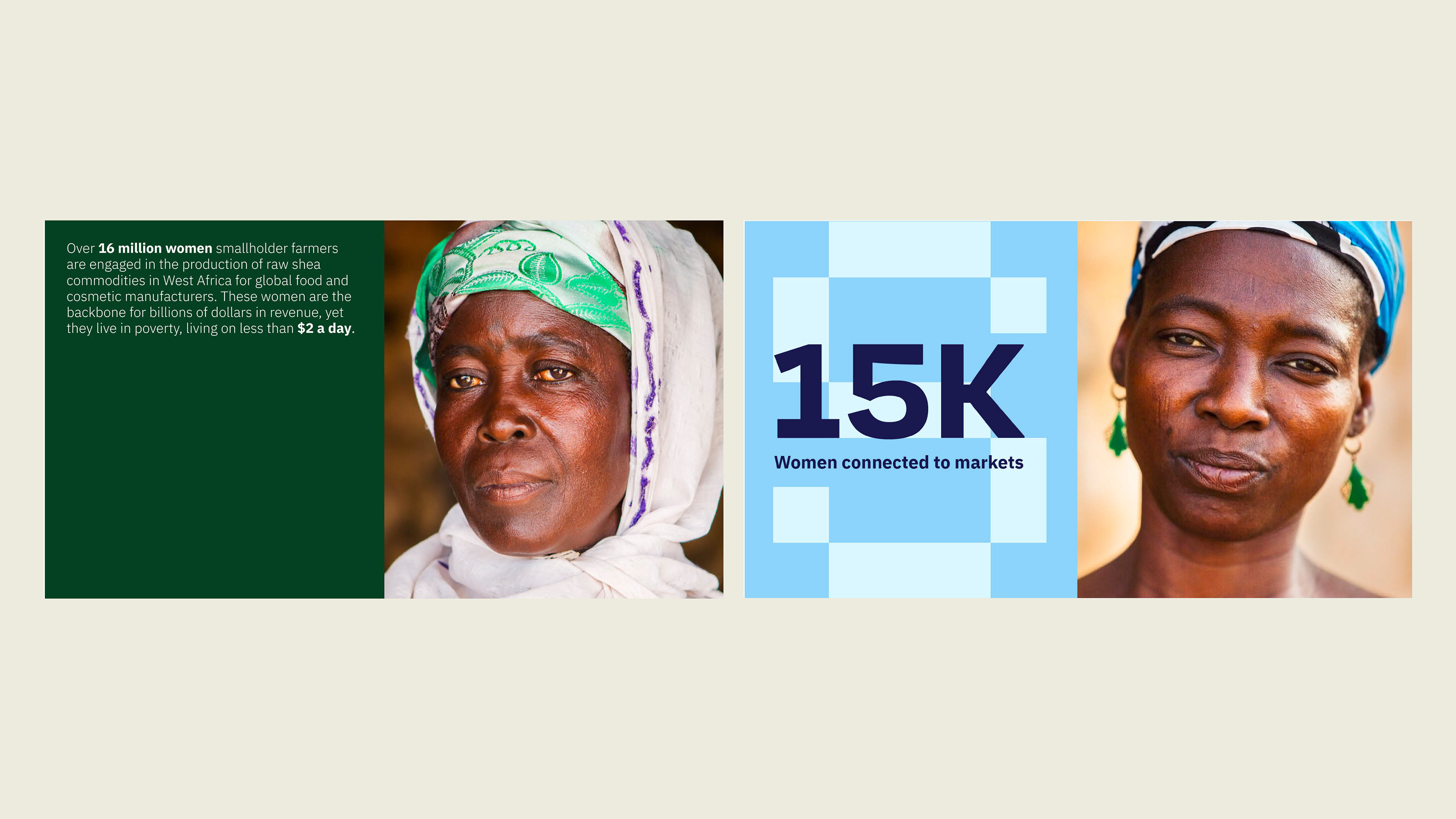
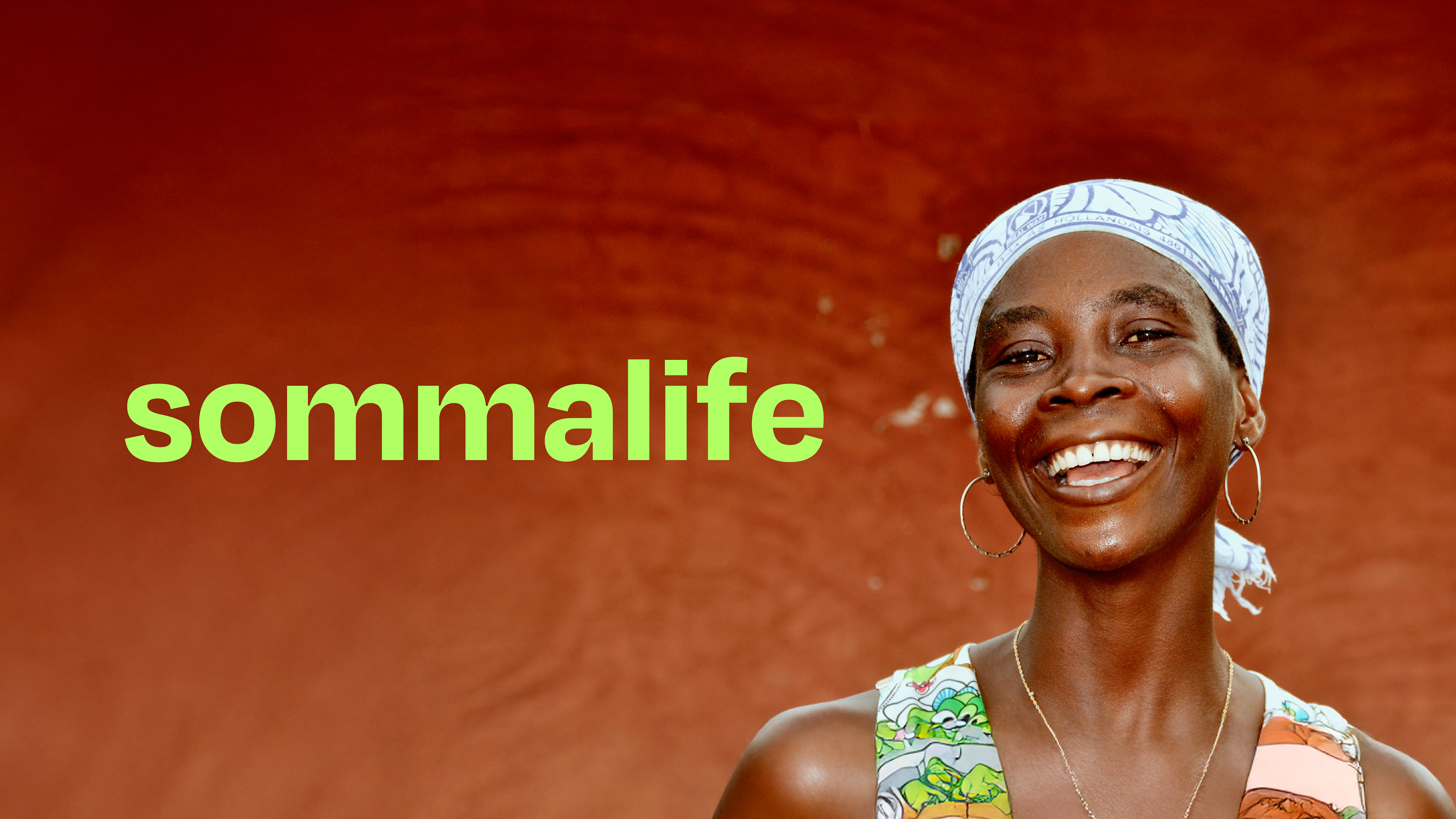
Sommalife is a social enterprise transforming the shea supply chain through transparency, technology, and sustainable trade. The project focused on creating a modern brand identity that balanced credibility with social impact, providing a flexible design system that could scale consistently across digital, print, and future brand communications.
ROLE
Leading the rebrand from concept to launch
Managing client communication and presenting creative direction
Creating a brand identity that resonated across European and West African markets
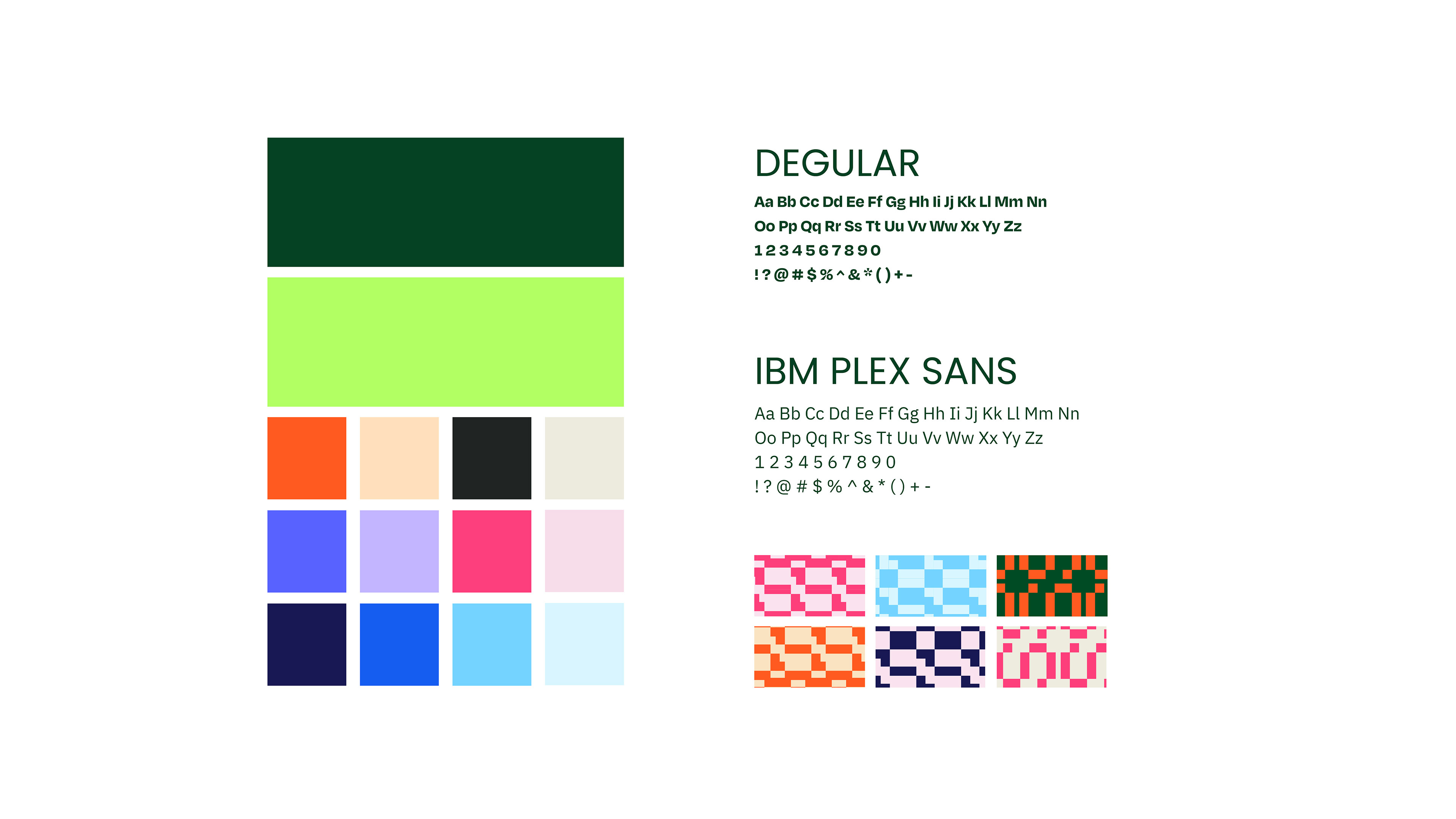
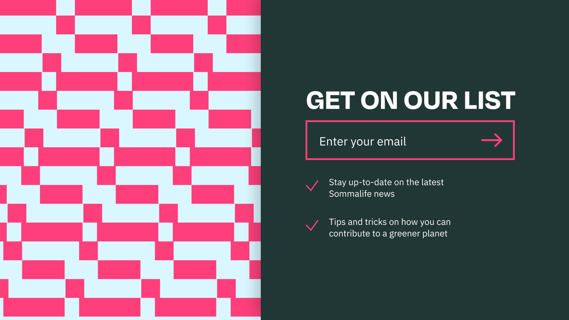
In creating the rebranding for Sommalife, great attention has been given to the choice of fonts and colors. The selected typeface is a modern and sleek font that is not only easy to read but also enhances the brand's refined aesthetic. It conveys simplicity and professionalism, aligning with Sommalife's core values.
The choice of colors plays a crucial role in conveying a sense of calm and balance. Sommalife primarily uses soft, natural tones, such as soothing blues and neutral earth shades. These colors create a tranquil atmosphere that aligns with the brand's vision of wellness and harmony. Together, the font and colors ensure that the Sommalife rebranding is both visually compelling and reflective of its commitment to well-being.