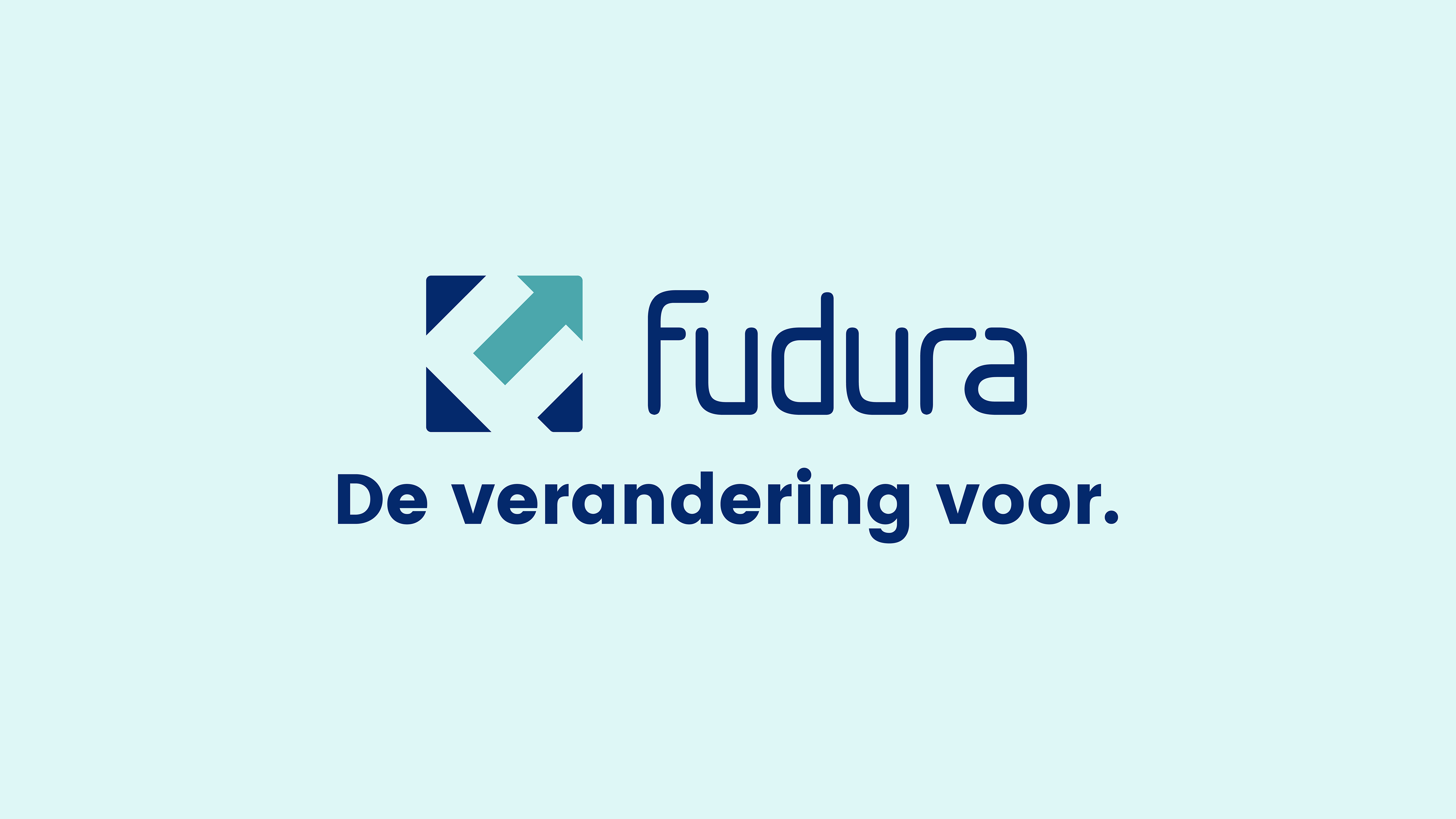
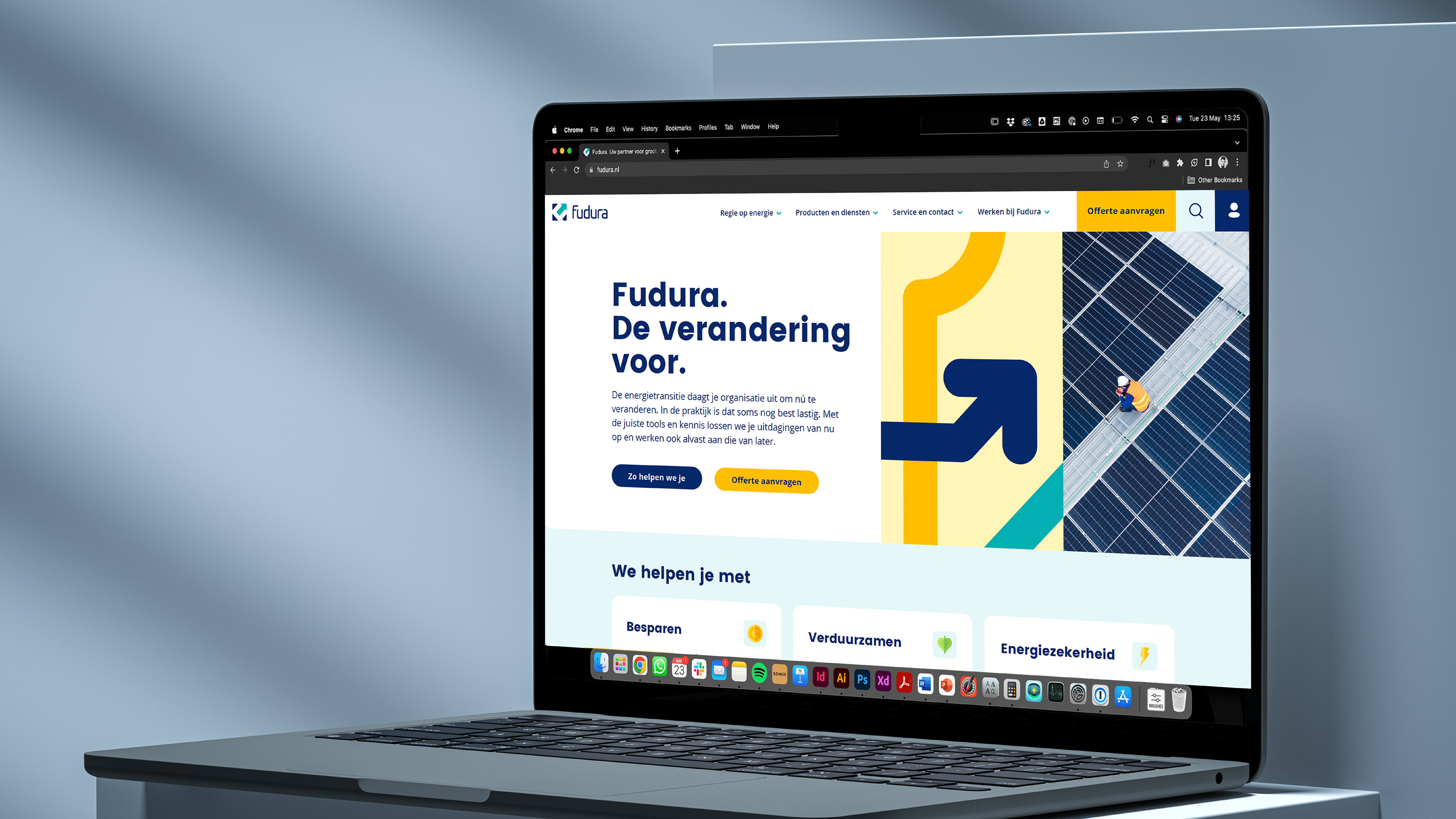
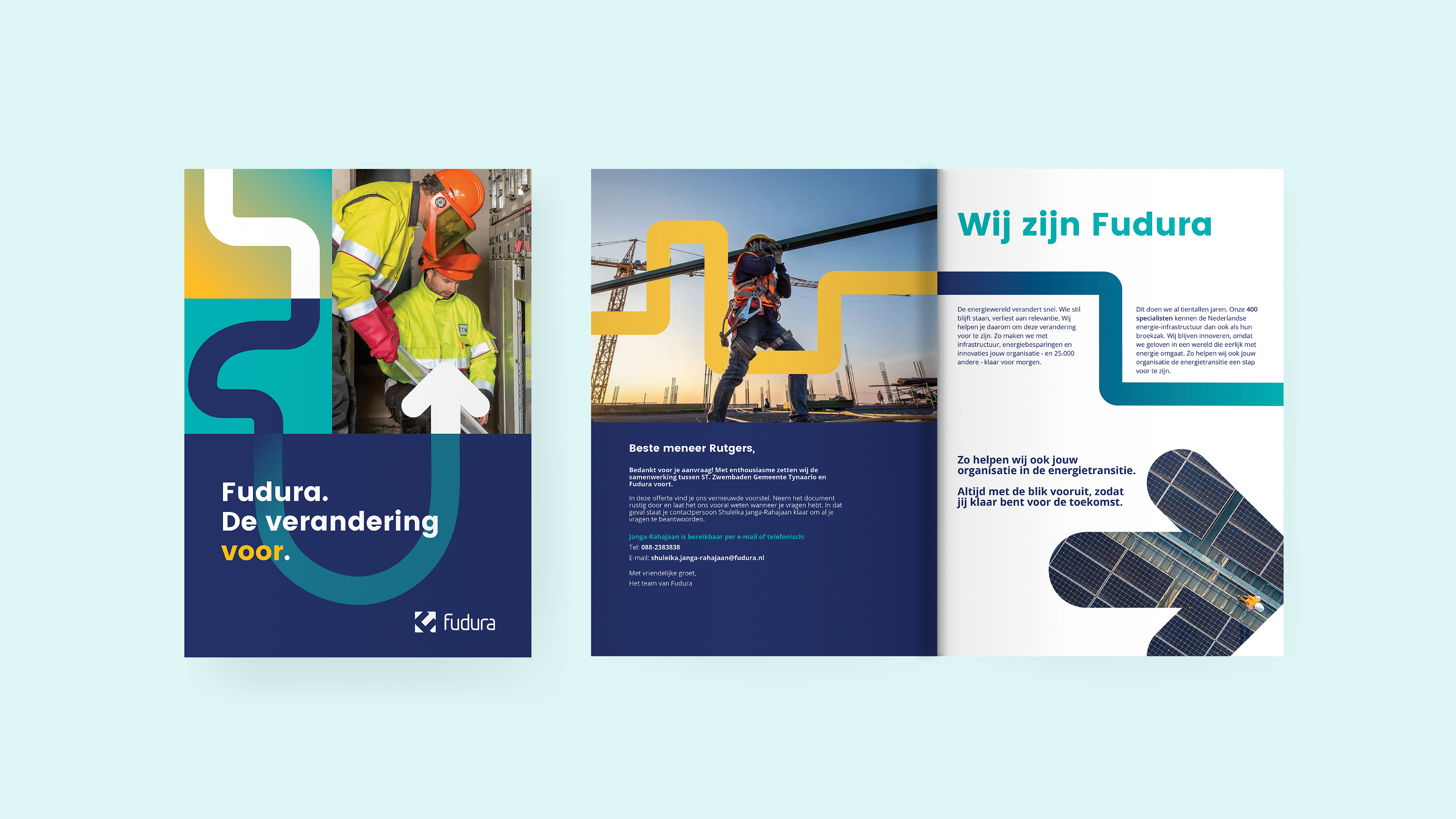
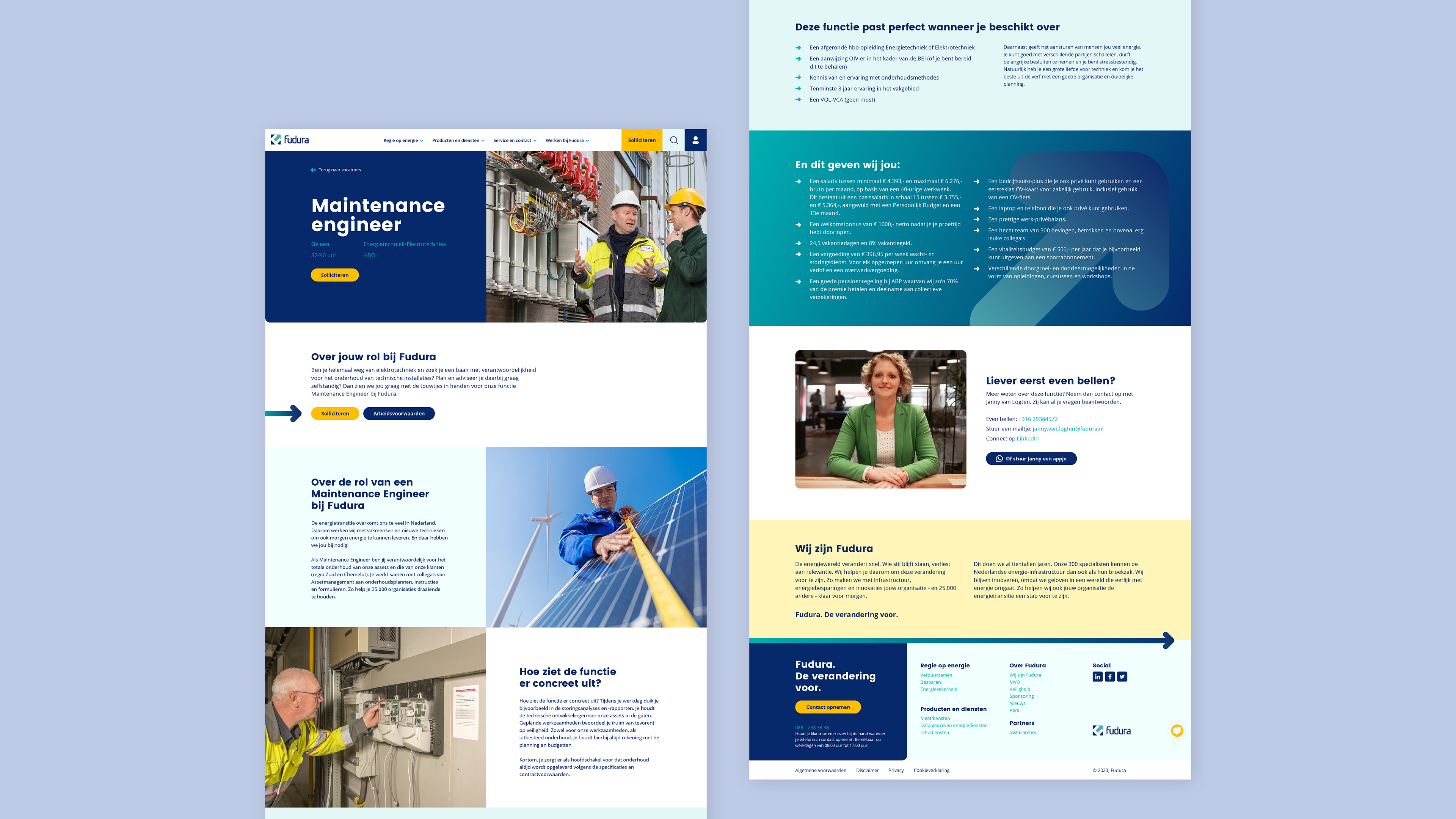
For Fudura, we developed a new brand positioning including a new brand identity. With this, we show that Fudura helps you get ahead of change. By using elements that contain movement - such as arrows and lines - that recur in photography and other communication tools. A super fun project with a lot of creative freedom!
Role: brand concept and visual identity design

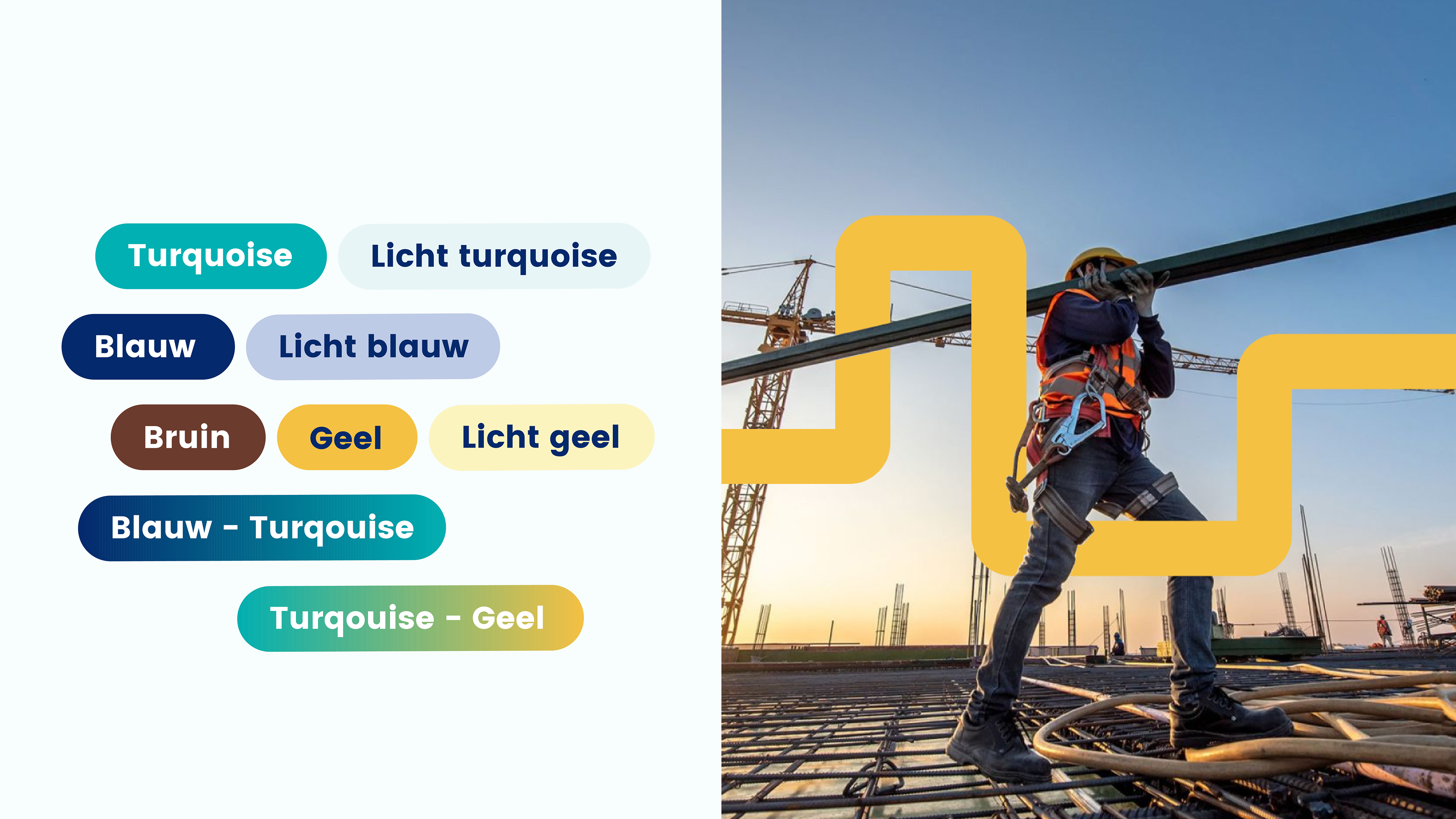
The rebranding wasn’t just about picking new colors or shapes — we also focused on typography. With the goal of incorporating softer, rounded forms, we chose the Poppins font for its clean, circular style. While the Fudura logo still uses its original font, Poppins is now the primary font for all other assets, giving the brand a fresh and modern look while maintaining a connection to its roots.